How to develop and be true to your interior design photographic style. The art of capturing interior design and architectural spaces.
To be relevant in an industry of many, we need to be thoughtful and consistent with the way we show up. For interior designers and architects, where aesthetics plays a strong role, the way we show our work - our photography style or the visual expression of our brand - becomes key for connecting with the right audience. It is also a way for our audience to weed out the many options and have an easier way to identify themselves with a style they are attracted to.
Through my collaborations with interior designers - photographing their work - I pay close attention to what they are saying about the space they have designed. We talk about the color and textures they chose, and how these helped create a certain mood or feeling. We start forming an idea of how we will creatively show this space. This process involves a series of conversations that include:
A walkthrough to understand what is relevant in the space and how we may want to show certain elements or features. We look at where the light is coming from and what we may do if it’s sunny or dark.
A discussion about their own style and use of light. If the client has a website, what are they showing and how does it look? Are the images consistent? or do they all have different styles?
A collaboration in creating a mood board that is specific to the space we are photographing. This may involve a Pinterest board collaboration.
How does this look in practice?
Below you will find two beautifully consistent recent projects photographed for two clients who are very clear in how they want to portray their work to their audience.
Sand Point Residence x Jennie Gruss
Jennie was extremely clear about the feeling she wanted to create for this home. As you enter the home, you feel enveloped by a soft light that travels beautifully and seamlessly between the indoor and outdoor areas. You can see the colors chosen across the rooms and how the light coming through the windows balances the shadows inside.
Clyde Hill Residence x Ayesha Usman
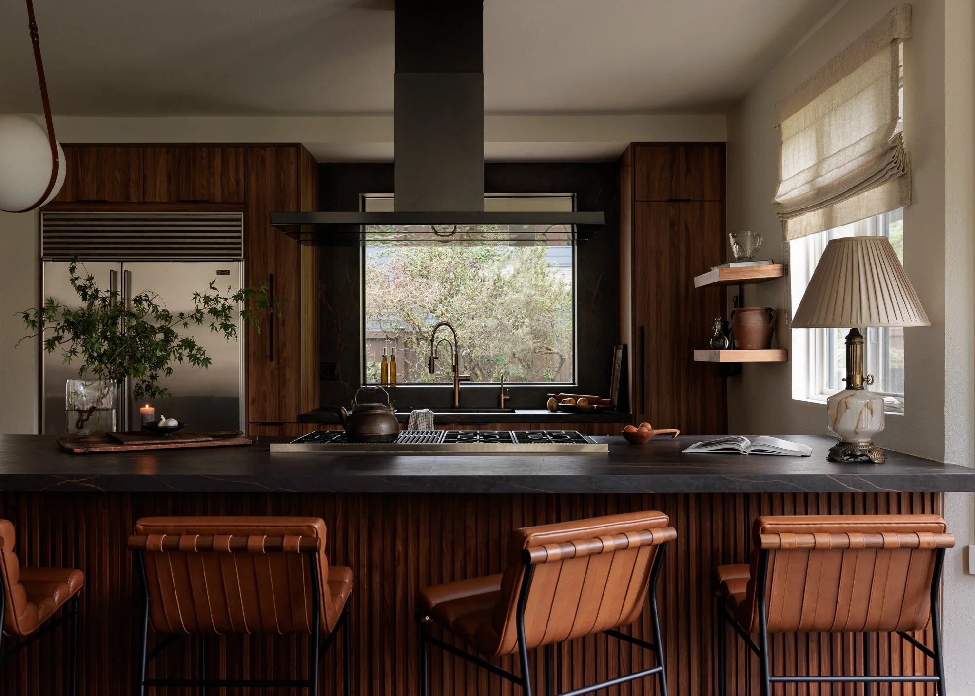
Ayesha is the epitome of mood and she’s wonderfully unapologetic about it. Her use of monochrome tones, dark and light allows for a style that is consistent throughout the entire space, and which is also carried through the photography. We photographed this home intentionally with very little light to show details and to capture the light and shadows featured in the design of the space.
Ultimately as a designer, and also as a photographer, you want to ensure that your style is part of your language and your brand. This will help you connect with the type of audience and prospective clients who are naturally attracted to your aesthetic. this does not mean that you cannot evolve and change, of course you can, but do so consistently and thoughtfully, so you are trully evolving and not just changing based on temporary trends.
Please connect with me if you want to discuss more about your own style and how to get there. I have written other articles about photographing your portfolio and also about investing in quality photography. I hope this is helpful to you.
And as always, thank you for reading,


